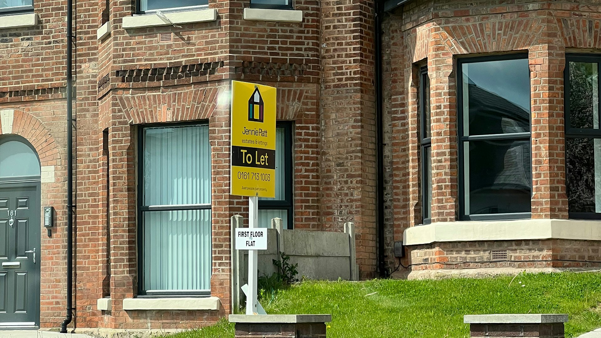

Jennie Platt Estates
Jennie Platt, a client who reached out to our studio in 2022, sought assistance with a comprehensive social media campaign and rebranding. Recognizing her desire to target a younger, art-savvy audience, we embarked on an in-depth research period, delving into the brands of her local competitors in Manchester. This groundwork laid the foundation for a complete branding pack that covered every aspect of her company, including typefaces, tone of voice, and imagery, ensuring consistent and impactful visual communication across all channels.
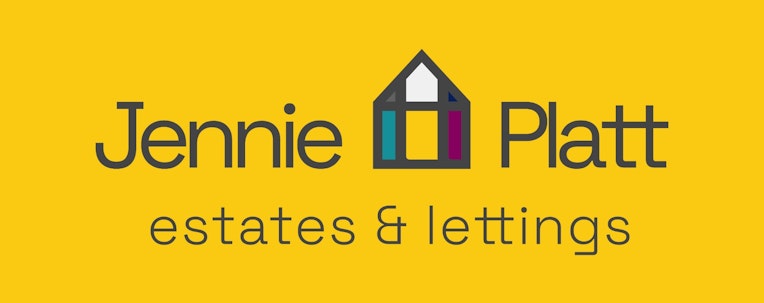
The logo we designed for Jennie Platt immediately evokes the concept of a house, an enduring symbol within the real estate industry. However, we added a memorable twist by incorporating two "t's" at the end of "Jennie Platt," symbolizing her vital role in guiding clients to their new homes. The color palette was thoughtfully chosen, drawing from frequently used hues in the industry. We complemented these colors with Jennie's distinctive branded yellow, highlighting the comprehensive range of services she offers, all housed under one roof.